Learn
Welcome to our gallery of creativity and caution! On this page, we’re thrilled to showcase 15 diverse Risk Matrix themes, each designed to add a splash of colour and personality to the serious business of risk assessment. From the vibrant hues of Electric Caution to the soothing tones of No Pastel Problems, there’s a palette for every taste and purpose. Enjoy exploring these themes, and if inspiration strikes, we’d love for you to mix, match, and make your own. Feel free to share your custom creations with us—after all, the world of risk management is brighter with a touch of personal flair.
Contents
1. Easter Bunny Alert
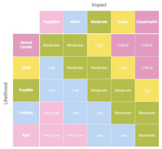
Background: #F7BEDC, #BCD5F3, #B5BE4A, #F9E263, #E29ABE
Text: #FFFFFF, #FFFFFF, #FFFFFF, #FFFFFF, #FFFFFF
Combine the whimsy of Easter with the serious task of risk assessment. Soft petal pink whispers of low risks among the early blossoms, while serene sky blue reflects the careful watchfulness of a clear spring sky. Sprouting green signals moderate risks with the vibrancy of new leaves, and sunshine yellow beams a warning for higher risks under the bright Easter sun. Blossom pink rounds out the palette, marking the most critical risks with the depth of late-spring flowers. Together, these colours guide a balanced journey through risk management, blending caution with the renewal and joy of the season.
2. Vintage Cautionary Tale
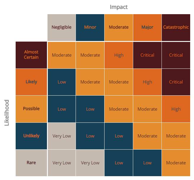
Background: #C5BAAF, #144058, #E58D2E, #DD671E, #4D181C
Text: #4D181C, #DD671E, #4D181C, #144058, #DD671E
This risk matrix theme weaves a narrative of risk management that harks back to the age of classic tales and timeless wisdom. A palette of muted elegance and bold statements, it speaks to the nuanced approach needed in identifying and addressing risks. Soft taupe sets the stage for low-risk scenarios, reminiscent of well-worn pages in an ancient manuscript, inviting careful contemplation. Deep navy blue, as endless as the night sky, signals a need for vigilance, marking areas of potential concern with the steadiness of a seasoned navigator. The fiery hues of pumpkin orange and burnt sienna draw attention to more immediate risks, igniting a sense of urgency with their vibrant call to action. Finally, the rich burgundy anchors the theme, denoting the most critical risks with the gravity of a vintage wine, deep and complex.
3. Stormy Strategies
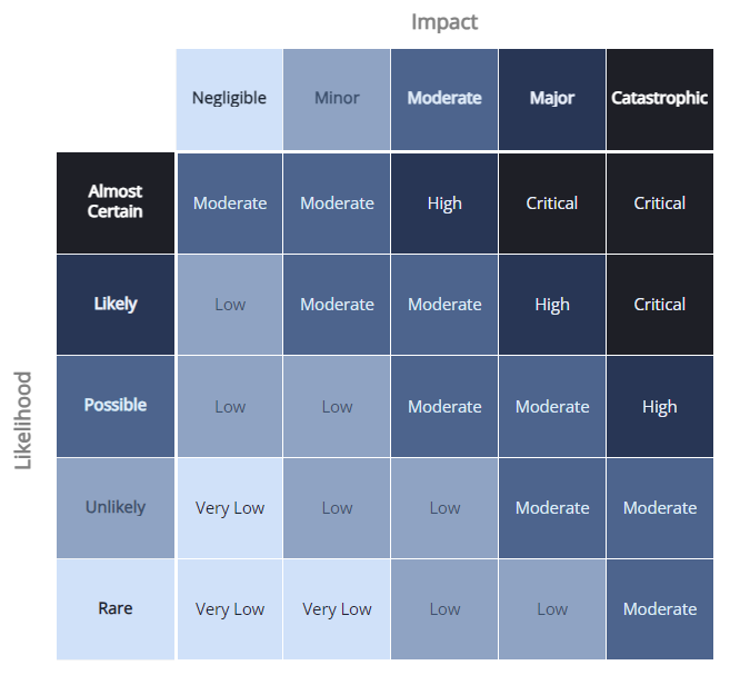
Background: #D0E1F9, #8FA3C3, #4D648D, #283655, #1E1F26
Text: #1D2633, #3D516E, #DFEBF8, #EAF0FB, #FFFFFF
Navigate through the tumultuous seas of risk management with a palette that mirrors the unpredictable nature of a gathering storm. It begins with the softest hint of danger in the palest blue, evoking the initial risks that lie on the horizon. The palette deepens into a medium slate, representing the growing complexity and uncertainty of risks that gather strength and demand attention. A dark denim blue embodies the serious, imminent challenges that require strategic navigation and swift decision-making. The deepest navy mirrors the peak of the tempest, where the highest risks and the most critical decisions reside in the shadowy depths of the storm. This risk matrix theme is anchored by the inky blackness of the darkest hour, symbolising the most severe and non-negotiable risks that must be faced with all the gravity and determination of a ship's captain steering through the night.
4. Mellow Yellow
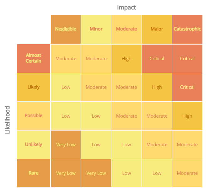
Background: #E49C49, #F9EC7E, #FDD96E, #F4C542, #E8805A
Text: #F9EC7E, #E8805A, #E8805A, #c86d04, #F9EC7E
Warm and inviting, this palette draws from the sunniest moments of the day, guiding risk assessment with a light-hearted yet earnest approach. From the golden glow of dawn to the rich hues of sunset, each colour serves as a beacon of optimism. Amber and light lemon shades highlight areas of low to moderate risk, reminding us that with vigilance comes the opportunity for growth and innovation. Sunny yellow intensify the alert for more substantial risks, casting a bright light on areas that require our attention. The soft terracotta rounds out the spectrum, marking the most critical risks with the warmth of the late evening sun, urging a mindful and considered approach to safeguard the path ahead. This blend of cheerful and earnest tones creates a balanced environment for navigating through potential challenges with a positive outlook.
5. Disco Dilemma
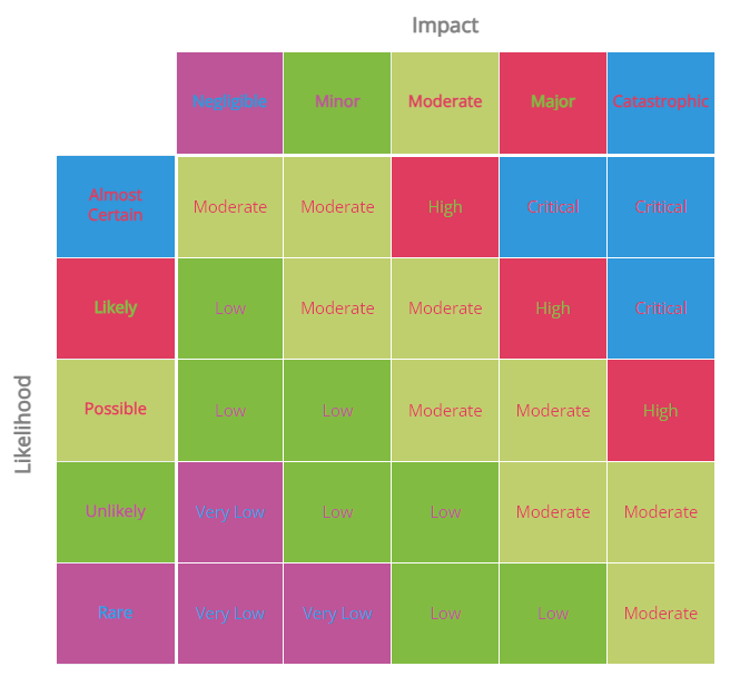
Background: #BD5598, #82BB42, #BFCF6E, #DF3C5F, #3098DB
Text: #3098DB, #BD5598, #DF3C5F, #82BB42, #DF3C5F
Capturing the vibrant essence of a night on the dance floor, this risk matrix theme pulses with the energy and unpredictability of a discotheque, setting the stage for dynamic risk assessment. The bright fuchsia and lively green highlight lower-risk areas with a beat that encourages bold moves and innovation. The soft lime and deep pink shift the rhythm to moderate risks, where caution meets the groove, prompting more calculated decisions amidst the revelry. The electric blue marks the highest risks, like a spotlight on the lead dancer, demanding focus and swift action to navigate through the night's challenges. This vivid palette orchestrates a lively approach to identifying and managing risks, ensuring that every move on the risk management dance floor is both calculated and full of life.
6. Silver Lining Solutions
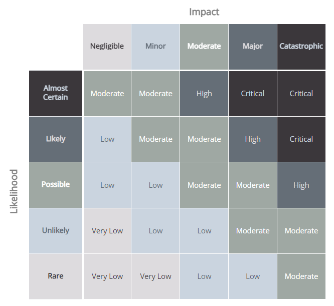
Background: #DDDBDE, #CAD4DF, #9FA8A3, #656E77, #3B373B
Text: #3B373B, #626B76, #FFFFFF, #DDDBDE, #CAD4DF
In this carefully curated palette, whispers of resilience and optimism float through a landscape of uncertainty, embodying the elegance of simplicity alongside the fortitude of serenity. Light silver and soft sky blue lay a foundation of hope and clarity, suggesting the potential to navigate even the most daunting risks with thoughtful consideration. A touch of cool slate introduces balance, grounding the decision-making process in calm pragmatism. Darker slate grey adds depth, symbolising the intricate challenges of risk assessment, while deep charcoal anchors the composition, representing a solid resolve to uncover solutions within adversity. Together, these colours craft a narrative of serene determination, illustrating that within every challenge, there exists an opportunity to find a path forward.
7. No Pastel Problems
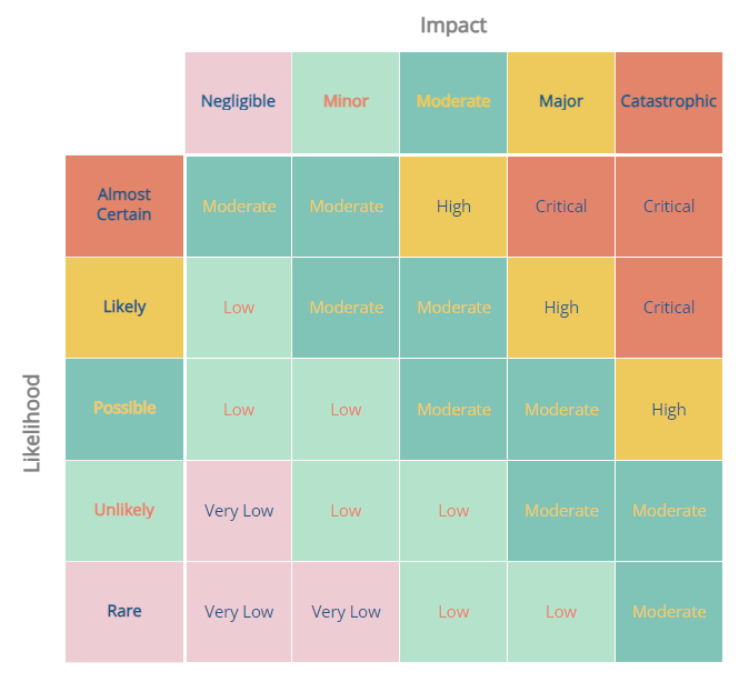
Background: #EECCD3, #B5E2CA, #80C4B7, #EEC95C, #E3856B
Text: #1A5789, #E3856B, #EEC95C, #1A5789, #1A5789
Blend the softness of spring with the warmth of summer sunsets, creating a serene yet uplifting atmosphere for navigating risks. Delicate pink and soothing mint offer a tranquil base, suggesting areas of low concern where opportunities for growth and innovation abound. The addition of teal introduces a refreshing dip into cooler waters, symbolising a mindful approach to challenges. Sunny yellow injects a burst of optimism, highlighting moderate risks with a positive outlook. Finally, a rich coral brings warmth and energy, marking areas of higher concern with a vibrant call to action. Together, these hues craft a narrative of balance and optimism, encouraging a thoughtful journey through the complexities of risk assessment.
8. Electric Caution
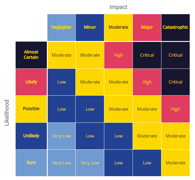
Background: #6F9BD1, #224193, #FFD700, #DF3C5F, #171631
Text: #FFD700, #FFD700, #171631, #FFD700, #FFD700
Electrify the senses with a bold spectrum that navigates through the terrain of risk with both caution and vibrancy. Deep and medium blues offer a backdrop of stability and trust, laying the groundwork for clear-headed decision-making amidst uncertainty. A striking bolt of bright yellow cuts through the palette signifying areas requiring immediate focus and action. Vibrant pink adds a dynamic layer, highlighting critical points that demand innovation and quick response. Anchored by a rich, dark navy, this combination embodies a night sky just before the storm, encapsulating the urgency and intensity of managing high stakes with precision and foresight.
9. Purple Prognosis
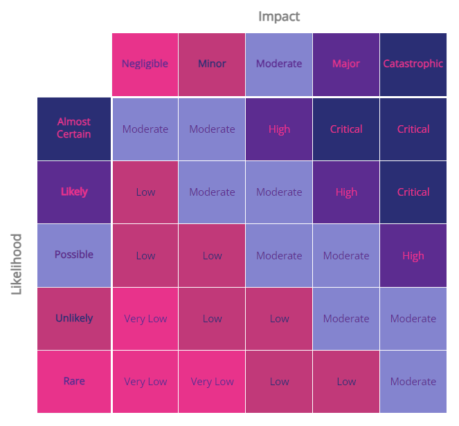
Background: #E8338B, #C13979, #8484CF, #5C2C90, #2A2E74
Text: #5C2C90, #2A2E74, #5C2C90, #E8338B, #E8338B
Vibrant pinks and deep purples merge with a touch of serene lavender, crafting a visual narrative of dynamic foresight and thoughtful strategy in the face of uncertainty. The lively pink tones inject a burst of energy and innovation, indicating areas of potential change and action. Transitioning to the darker purples, a sense of depth and reflection emerges, suggesting the complexities and deeper insights required for effective risk management. The inclusion of a calming lavender offers balance, symbolising the clarity and calm needed to navigate through challenges with wisdom. Together, these hues weave a story of proactive planning and resilience, encouraging a balanced approach to anticipating and addressing potential risks.
10. Sea Serenity
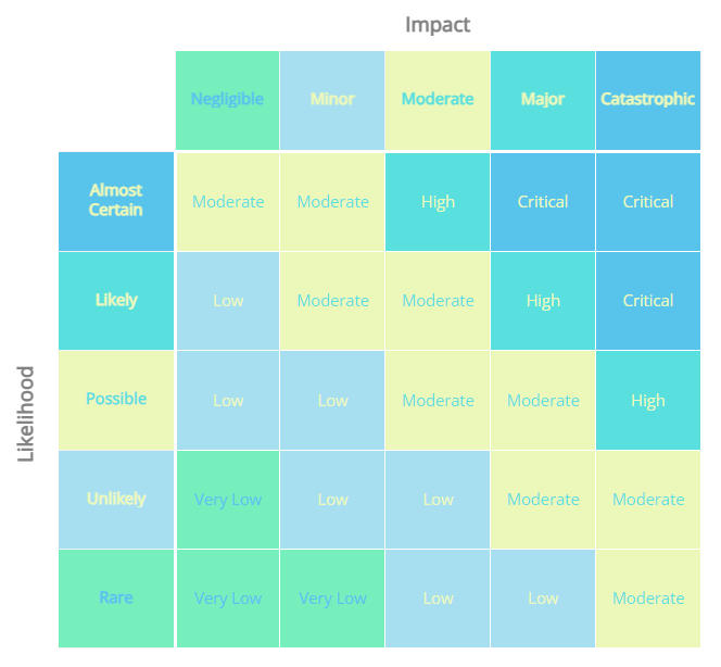
Background: #77EFBD, #A7DFF0, #ECF8BA, #5ADFDF, #59C4EB
Text: #59C4EB, #ECF8BA, #5ADFDF, #ECF8BA, #ECF8BA
This palette eloquently conveys the fluid dynamics of risk management, reminiscent of navigating through serene yet unpredictable ocean waters. The vivid green mirrors the clarity achieved when risks are identified and assessed with precision, while the airy blue represents the calm confidence in strategic planning. The luminous yellow suggests the optimism that comes from effectively mitigating risks, illuminating the path forward. Deepening into a richer aqua, we delve into the complexities of risk, where deeper analysis reveals insights critical for informed decision-making. The overarching theme is one of balance and foresight, akin to charting a course through serene seas, acknowledging the ever-present undercurrents of challenge and opportunity. This blend of hues encourages a harmonious approach to risk, advocating for vigilance, adaptability, and the pursuit of strategic tranquillity.
11. Cautious Canyon
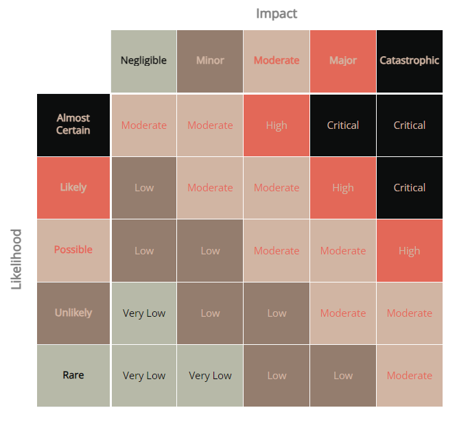
Background: #B7B9A8, #947D6E, #D1B5A3, #E36858, #0C0D0D
Text: #0C0D0D, #D1B5A3, #E36858, #D1B5A3, #D1B5A3
Channel the stoic beauty and inherent warnings of a canyon landscape at dusk. It melds the soothing neutrality of earth tones with a vivid splash of sunset, encouraging a thoughtful approach to risk assessment. The subdued greens and greys offer a base of stability and reliability, reminiscent of the canyon's ancient walls. A touch of soft peach mirrors the fleeting light of dawn, symbolising new beginnings and cautious optimism. The bold, fiery orange serves as a stark reminder of the inherent dangers and the importance of vigilance in decision-making. Anchored by the deep, almost black green, this palette grounds the matrix in seriousness, emphasising the critical nature of carefully navigating through risks. Together, these colours craft a narrative of caution and preparedness, guiding the viewer through the complexities of risk with a balanced, measured approach.
12. Embrace The Red
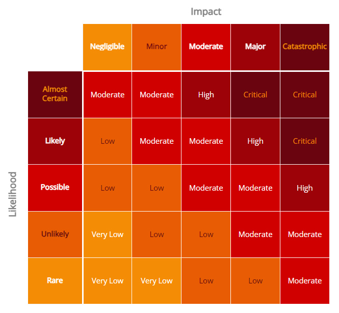
Background: #F48C06, #E85D04, #D00000, #9D0208, #6A040F
Text: #FFFFFF, #6A040F, #FFFFFF, #FFFFFF, #F48C06
They say seeing red in your risk assessments is about as welcome as a hedgehog in a balloon factory, but with this theme, you're not just facing the fiery gauntlet—you're giving it a firm handshake. Here, the spectrum of reds from bright orange to deep maroon isn't just a warning; it's a battle cry. The vibrant orange at the outset ignites a spark of boldness, a call to action against looming challenges. This transitions into a blaze of reds that encapsulate the urgency and critical nature of high-risk areas. Deeper tones suggest the seriousness and depth of the risks at hand, ensuring that caution and strategy are at the forefront of your decision-making process. This theme isn't just about acknowledging risk; it's about embracing it with open arms and a strategic mind, turning potential threats into managed challenges.
13. Pale Precaution
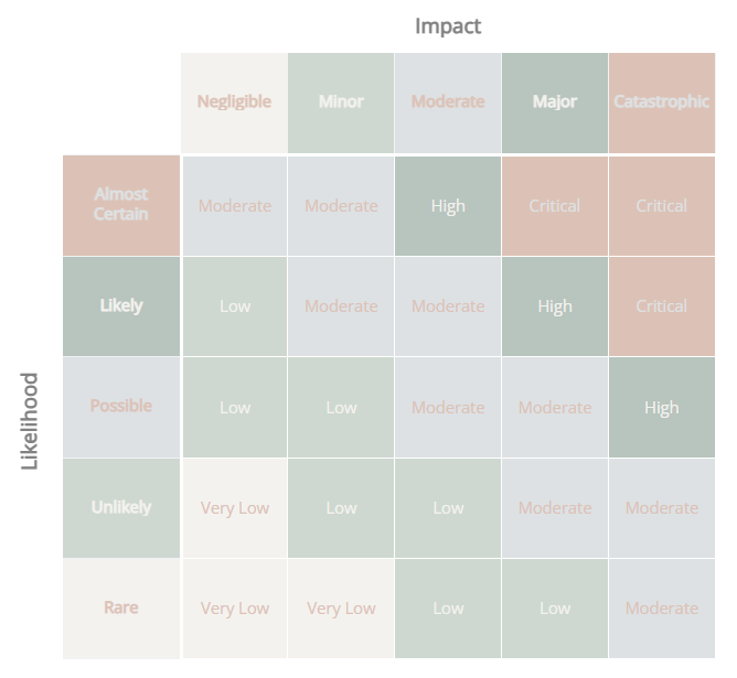
Background: #F48C06, #E85D04, #D00000, #9D0208, #6A040F
Text: #FFFFFF, #6A040F, #FFFFFF, #FFFFFF, #F48C06
Embody the essence of understated vigilance, weave together a tapestry of soft, ethereal tones that suggest a careful, measured approach to risk management. The gentle interplay of light neutrals and muted accents creates a visual metaphor for the nuanced, thoughtful analysis required to navigate uncertainties. Here, caution doesn’t shout; it whispers, encouraging a reflective and strategic examination of potential challenges. The overall effect is one of serene attentiveness, where risks are managed not with alarm but with a composed and mindful strategy.
14. Green For Go
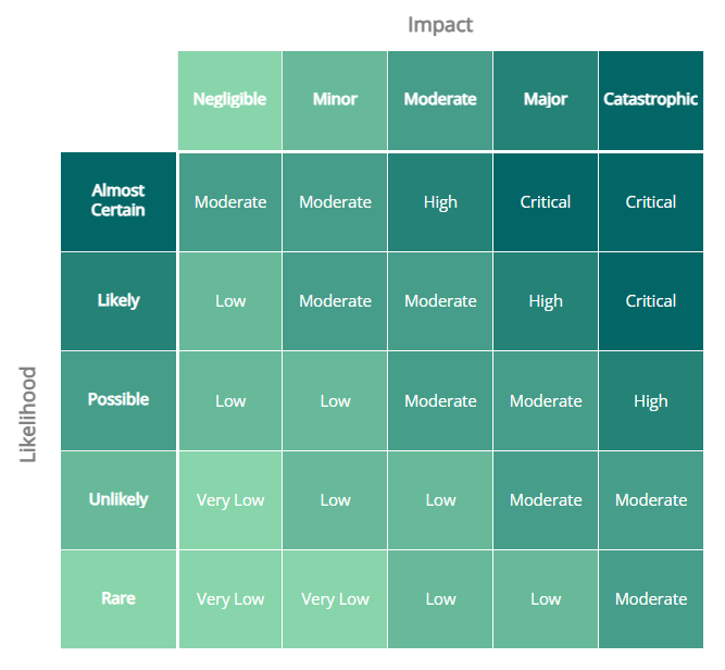
Background: #88D4AB, #67B99A, #469D89, #248277, #036666
Text: #FFFFFF, #FFFFFF, #FFFFFF, #FFFFFF, #FFFFFF
Taking inspiration from the universally recognised signal to proceed, translate it into a spectrum of greens that guide the assessment of risk with clarity and momentum. From the vibrant freshness of new beginnings to the depth of steadfast resolve, each shade builds upon the last to symbolise progression and growth. It's a visual journey through the stages of addressing risks, encapsulating the move from caution to action. Here, the focus is on forward movement, encouraging a dynamic approach to navigating challenges, with each hue reinforcing the message that, with careful planning and clear insight, it's possible to advance confidently.
15. Cosmic Calm
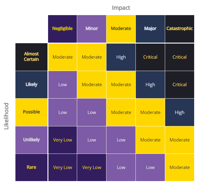
Background: #321E5F, #7D5BA6, #FFD700, #283655, #1E1F26
Text: #E5CE09, #E2E2E2, #1D2633, #EAF0FB, #FFD966
Drifting through the vast expanse of the cosmos, this risk matrix theme embodies the serene yet profound nature of space, guiding the journey of risk assessment with a sense of deep tranquility and awe-inspiring wonder. The deep indigo and soft lavender shades mirror the infinite night sky, marking lower risks with the quiet confidence of the cosmos. The striking gold illuminates areas of moderate risk with a celestial glow, highlighting paths of opportunity through the darkness. Dark slate and almost black anchor the palette, representing the most profound risks with the unfathomable depths of space, reminding us of the vast unknowns that require our utmost attention and respect. This ethereal blend of colours invites a contemplative approach to risk, encouraging decisions that are as measured and expansive as the universe itself.


